This year's fashion-forward colour - for food
A recipe for yogurt mousse with a strawberry coulis
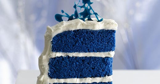
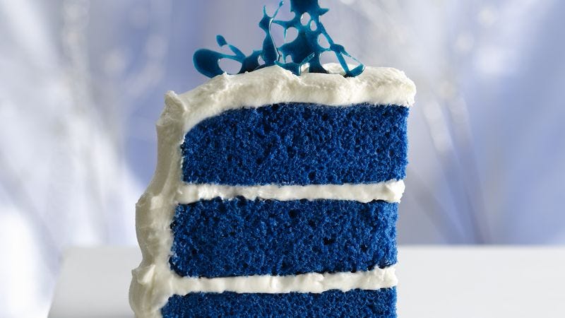
When my sister was still in school uniform, before social media raised its (ugly?) head, she baked a sponge cake for a swarm of even smaller children. With the enthusiasm of youth, she tinted its batter blue. The children ate the cake with fearful reluctance - if they dared tuck into the disturbingly tinted confection at all. Betty Crocker would have found them misguided. Today, the manufacturer offers a mix for this Royal Blue Velvet Cake.
Apicius, the 1st century Roman greedy-piggy, is apparently the gourmand who gave us the saying “We eat first with our eyes.”
Although we of course engage our tongues and noses, too, the eyes are the first instigators in getting our digestive juices going. Their role, from when cave people first went foraging, is to spot at speed the most appealing and nutritious foods, identifying them by their colour.
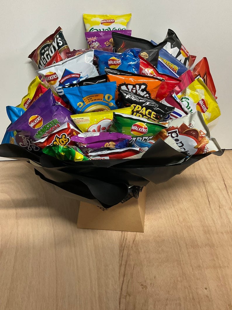
Given the amount of money invested by Big Food Biz in packaging - a global market worth $338.34 billion in 2021 and projected to grow more than 40 percent to $478 billion by 2028 - it seems indisputable that the eyes do have it. The processed food industry pays huge sums to supermarket chains for the right to place its gaudy products on those shelves with the greatest footfall. Why are we are so readily tempted by crinkly packages in red, orange and yellow with cartoon or cheerful emoji images taking up that space? Because those eye-catching colours have been established scientifically as the ones most likely to excite the senses and make us feel hungry.
Back in 2021, I examined ‘flavorists’ - scientists employed to create new tastes to seduce eaters into buying foods the body doesn’t necessarily benefit from. Big Food Biz also relies on colourists. Pantone, the company invented in 1963 to come up with the global fashion industry's next trending colour, also spreads its persuasive magic over the food industry.
Purchasing decisions are made within 90 seconds of interacting with a product. 62 to 90 percent of buying decisions are based on colour alone. Proctor & Gamble call the first 3 to 7 seconds after a shopper spots an item on a food shelf the most precious - “the first moment of truth”.
Anyone doubting the importance of colour should take a look at the food photographs uploaded in the bazillion to TikTok and Instagram, where taste and smell can’t come into play.
Cargill, the privately held American global food corporation and the USA’s largest privately held corporation in terms of revenue, has developed a range of chocolate products to help bakery brands “capture the eye”. This includes Bright White chocolate. Before this “truly white” chocolate, white chocolate was (disappointingly?) only creamy in hue. Pursuing every possible and opposing sales angle, Cargill has also come up with Magnificent Black because, according to Philippe Bernay, head, in the bakery sector, of commercial marketing in Europe, the Middle East and Africa, “Darker colours are associated with more intense flavour, better taste and are considered more premium.”
But it would seem that in its colour choice, Cargill is way off mark - as might well be Betty Crocker with Royal Blue Velvet Cake: Pantone’s colour for 2023 “to boost mood and reconnect with nature” is Viva Magenta.
Jeff Turner is innovation controller at the British cake manufacturer BBF Ltd. “Viva Magenta is a shade of deep red that is rooted in nature.” Now we’re free to frolic outside again, Nature is a common trend, apparently, in colours everywhere this year. “We are experiencing more of the outdoors than ever before and this is translating into many aspects of our lives, including bakery,” he says. (The nuts this sounds aren’t those on trees.) Again hedging all commercial bets, pastels, too, in soft pinks, yellows, blues, mints and greens “are expected to create calming, nurturing and serene bakery experiences that invite people to reconnect with themselves and those around them.”
Who knew cake had so much power?
My sister was ahead of her time. Turner, not wanting to leave any single colour out of his arsenal of possibilities, also says blue will be a colour we begin to see more over the coming years. It’s a result of the trend for mood boosting. “The reason that blue is going to increase in popularity is that it’s thought to evoke feelings of calmness and relaxation.”
Just in case it can’t, mood-boosting flavours are also being created. ‘Sleep chocolate’ is mixed with lavender and chamomile to provide extra comfort, sold in soothing lilac and purple packaging for emphasis.
It will come as no surprise that this focus on colour is affecting the price of the finished product in your shopping basket. Doesn’t everything? In this case, the war in Ukraine has made the growing of wheat more profitable than growing vegetables, so farmers are scrubbing those crops in favour of grain. With vegetables now in diminished supply, the colours extracted from them have shot up in price. Manufacturers are not concerned that shoppers will respond adversely. Says Turner, “As people are becoming more aware of price due to the cost-of-living crisis, they are looking to purchase products that look good.”
Are we really such sheep? Apparently.
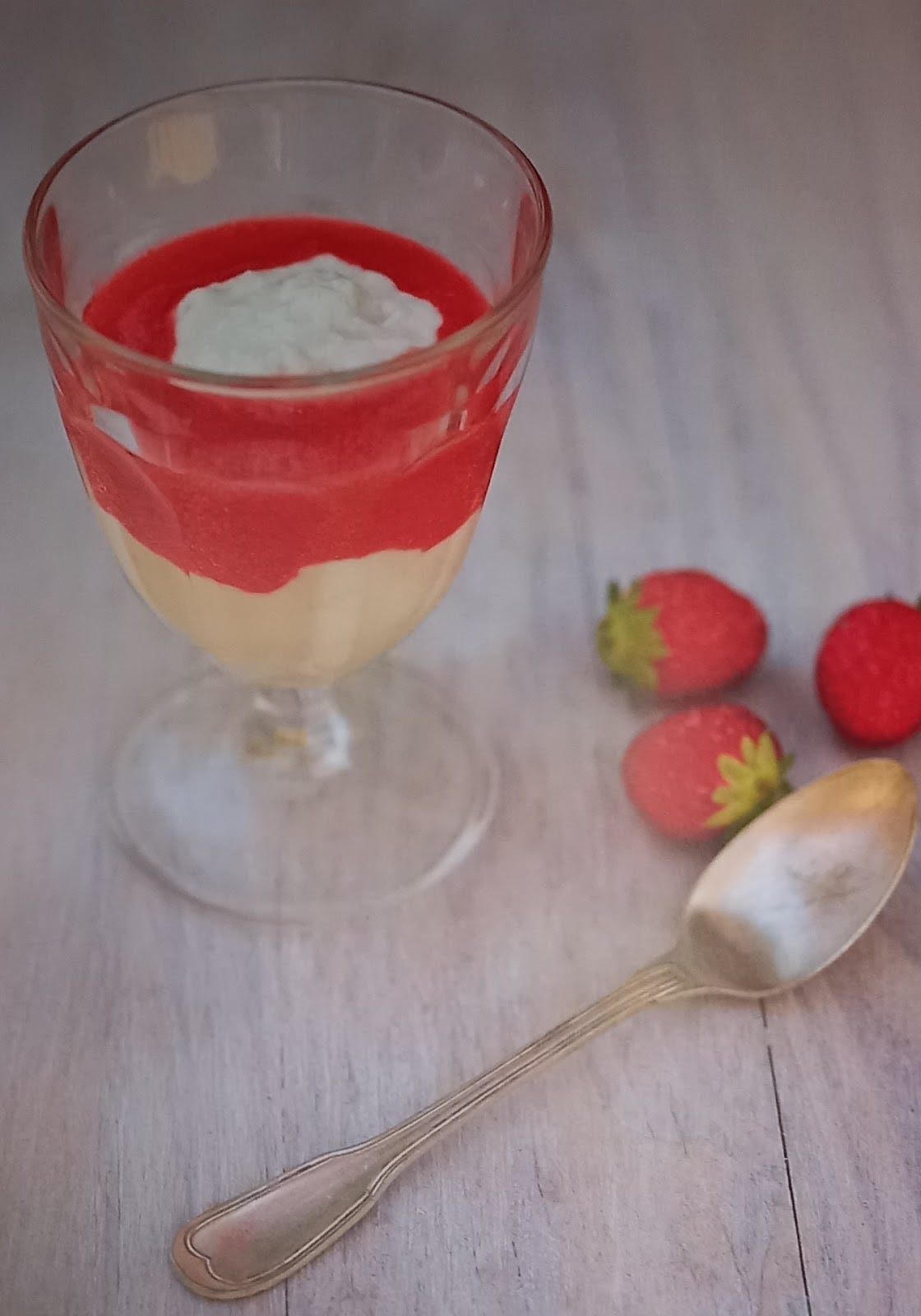
This easy summer pudding, almost in Viva Magenta, tastes as good as it looks. If you don’t tell your diners it’s made from yogurt, it’s unlikely they’ll guess.
225g/8 oz Greek or plain full-fat yogurt (nonfat, low-fat, or semi-fat won’t work)
5 tablespoons superfine sugar
½ teaspoon vanilla extract
1 egg white
Drain the yogurt in a sieve lined with a paper towel for at least an hour. Discard the liquid. Beat the sugar into the yogurt till it’s shiny, then add the vanilla and beat that in, too. Not more than 2 hours before the meal, whisk the egg white into soft peaks then fold it into the yogurt. Pile 2 or 3 tablespoons of the mousse into the centre of each pretty glass, and surround the mousse with coulis de fraises.
Coulis de fraises - Strawberry Sauce
150g/5oz strawberries
75g/2½ oz sugar
Juice of 2 lemons
Puree the strawberries in a blender. Add the sugar and lemon juice, and blend again. Pass the coulis through a fine sieve to remove as many of the seeds as you can, then chill the sauce in a jug till you’re ready to pour it around the mousse.


Blue has always been my favourite artificial flavour. And while I generally associate it with raspberry (thank you, 7-11 slurpees!), many years ago I bought a macaron from Yauatcha that was electric blue and somehow (mind-bogglingly...) tasted of BLUE, and not of any discernible flavour. I was so taken aback by the experience I had my companion take a bite and ask them what they thought. "IT TASTES OF BLUE!" was the reply. "BLUE!"
Definitely unsure about Royal blue cake! The only blue things I've ever eaten have been blueberries, blue icing and borage flowers - in my mind, it just doesn't seem a 'proper' food colour! Maybe because a lot of things in Nature equate blue with being actively bad for one - Aconitum napellus (monkshood) to name but one. The science behind food selection is interesting, though - such a very short time from seeing to selecting, and all based on colour. Makes you wonder about the colour-blind, though ... or should I be calling them 'differently visioned'? Yummy recipe, thanks again!